BESPOKE INTERIOR DESIGN / BRANDING
Crafting a new bespoke furnitures brand: Studio LBI
Facing more and more requests for bespoke cabinets, furniture and kitchens, Louise Bramhill, of Louise Bramhill Interiors, decided to establish a new venture to helm these works.
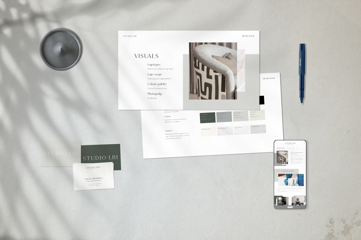
About this project
Scotland-based interior designer Louise Bramhill established her practice in 2006, realising commissions across the country with her signature blend of classical influences and contemporary edge.
As part of their projects, the practice would often create bespoke furniture, joinery and cabinetry to bring to life the vision of their clients. Their continued delight with these unique pieces led her to consider launching Studio LBI, a new venture to cover these realisations.
Louise contacted me for advice and we worked together on scoping the project and how to best approach it.
Crafting the visual identity of an interiors design practice in collaboration with the founder.
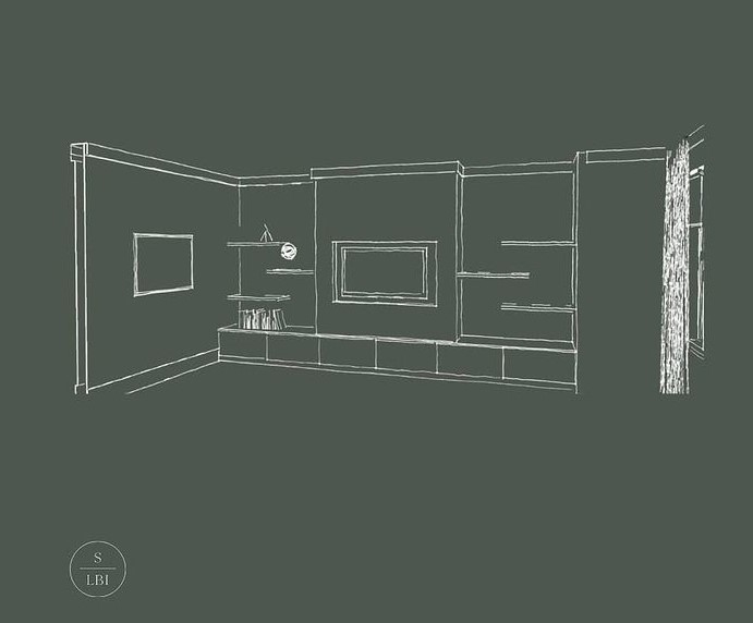
Early drawings for a bespoke joinery project by Studio LBI.
Brand strategy & creative route
We started with an extensive research in both the process of the practice and the existing landscape of brands producing similarly sophisticated pieces for the home.
The brand strategy was derived from a number of key themes – lucid elegance, crafted handmade and a certain modernity – as well as the values of the creatives forming the practice.
The open process allowed for a profound understanding of the practice’s values, approach and ways of working, which in turn was infused in the brand.
Mirroring their collaborative approach with their own clients, Studio LBI was keen to open a design dialogue with me, meaning quick iterations and a truly open process. The back and forth was rich and allowed for a real depth of understanding.
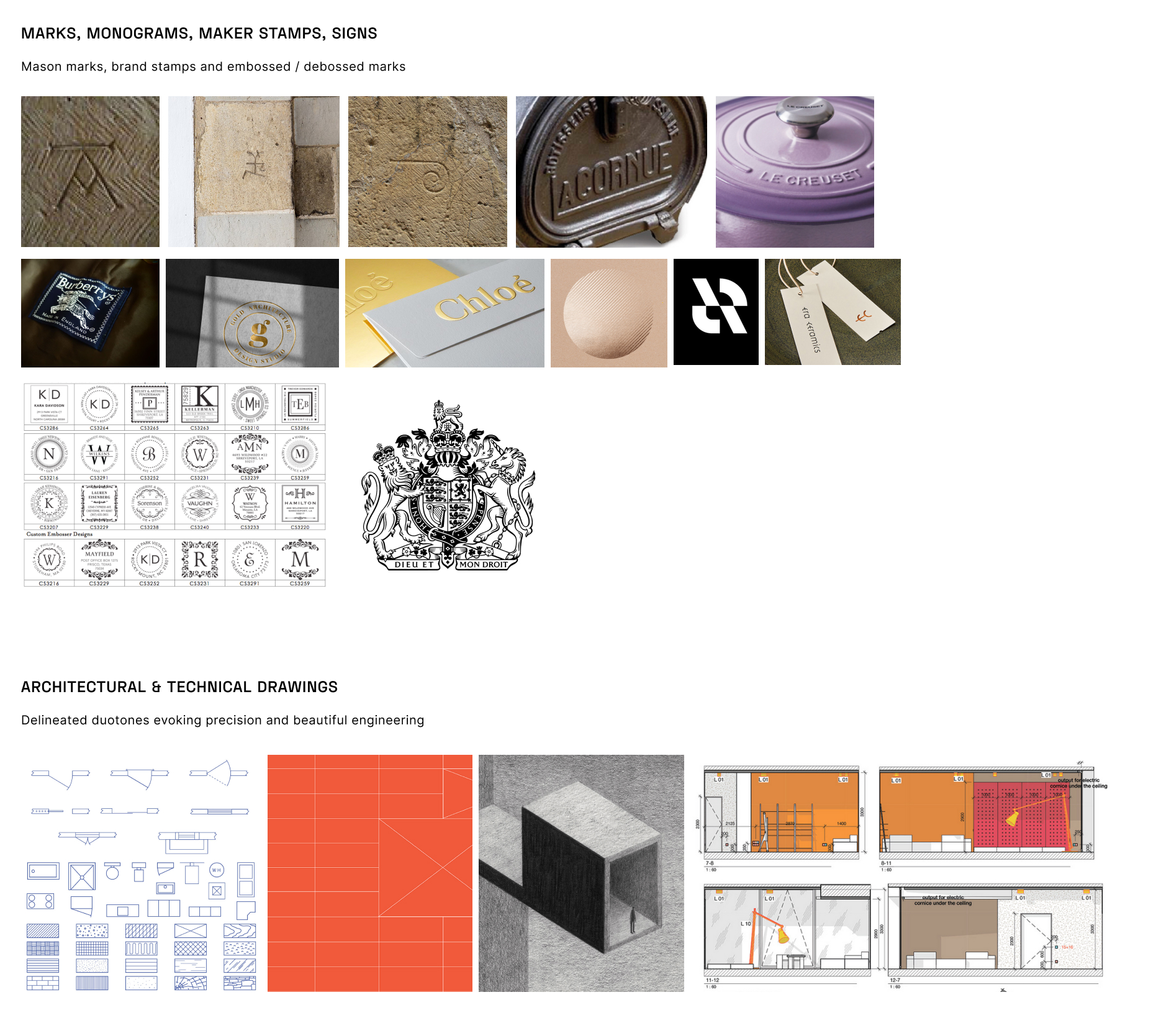
Studying the visual language of a few of the staples of homeware, makers marks and the codification of technical drawings.
Name and visual identity
The name Studio LBI had already been decided, so we focused on how to best bring to life the studio’s values into an elegant, crafted and layered brand.
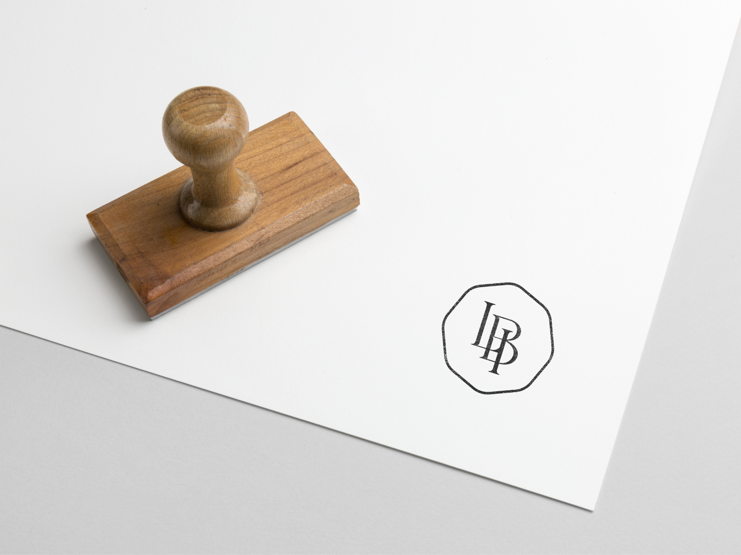
One of the early sources of inspiration for the brand were vintage makers marks in an array of craft disciplines.
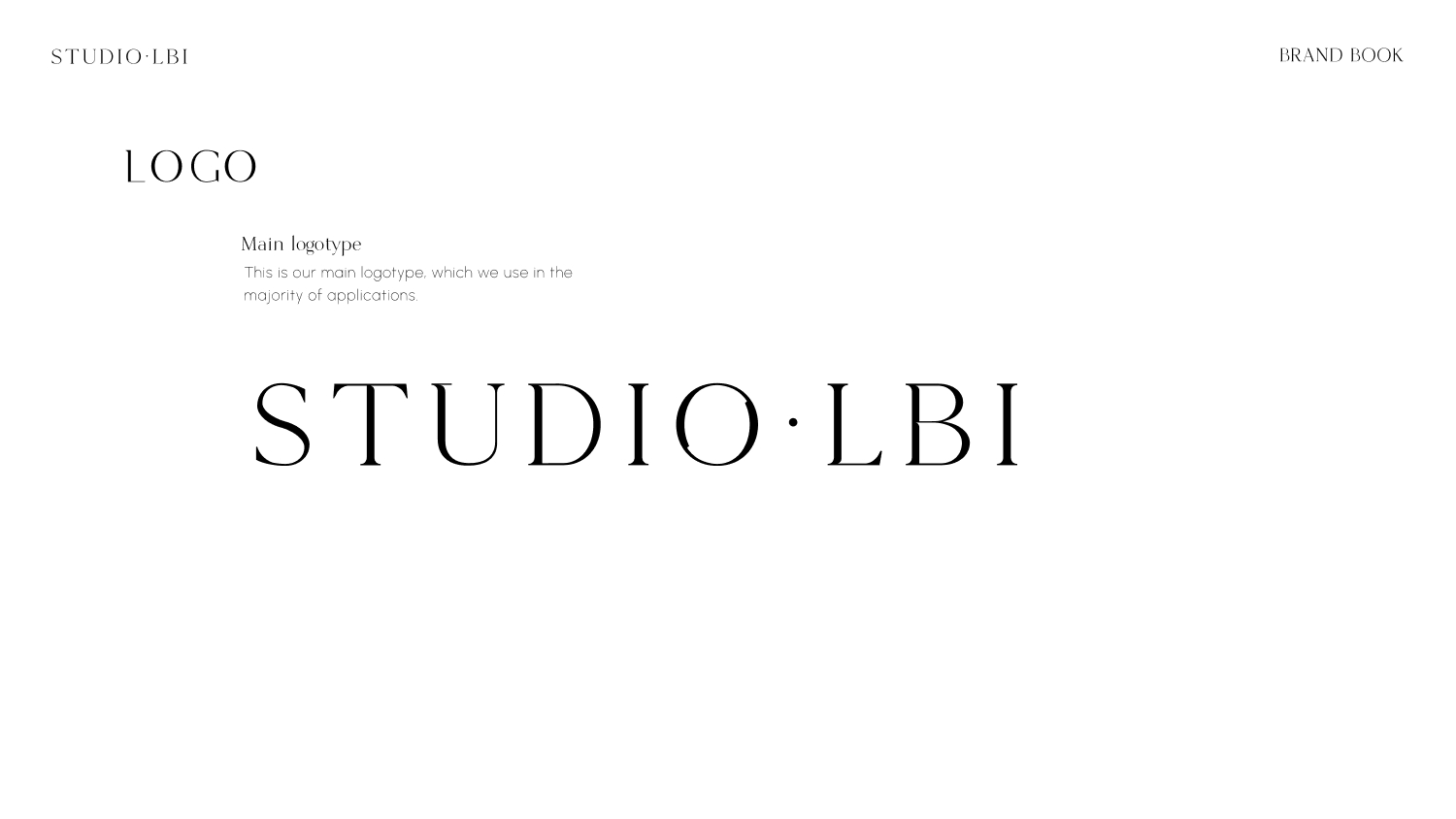
The main logotype was crafted with minimal treatment, using a lightly customised lettering anchored around a cycling, fluid “O”. The asymettry of the name is offset by the dot and bespoke, per-letter kerning, resulting in a refined logotype.

The overall identity is inspired by natural materials which the studio uses in their realisations. Slate, stone and textures make their way through the distinct layers of applications, creating a warm and tactile palette that feels organic yet elegant.
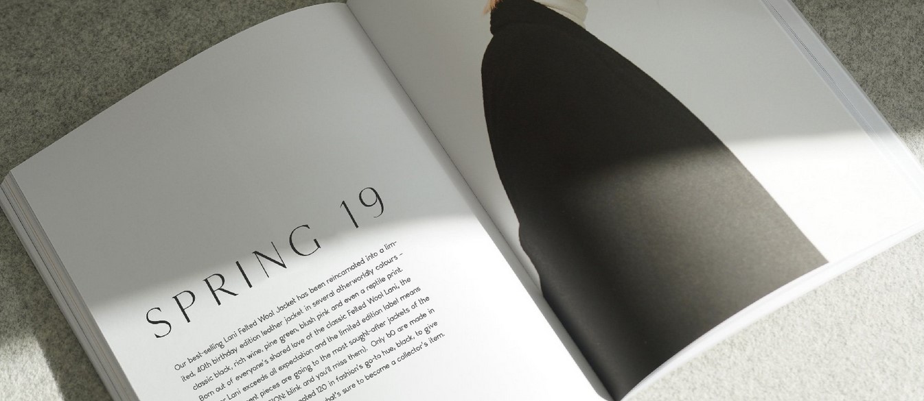
We spent a lot of time selecting and customising the fonts for the project, thinking through the various applications. We wanted to inject variety and character, while keeping the weights to the lighter end of the spectrum to convey a higher-end look and feel.
We led with the beautifully balanced hybrid of serif and sans serif MARIGOLD, from Byron Bay-based New Tropical Design, paired with their subtly ligatured Hunter font for headers.
For copy, we opted for Machine Kerning‘s stunning open-source Urbanist font. The low-contrast, voluntarily elemental design brings balance to the more characterful header duet, forming the perfect trio.
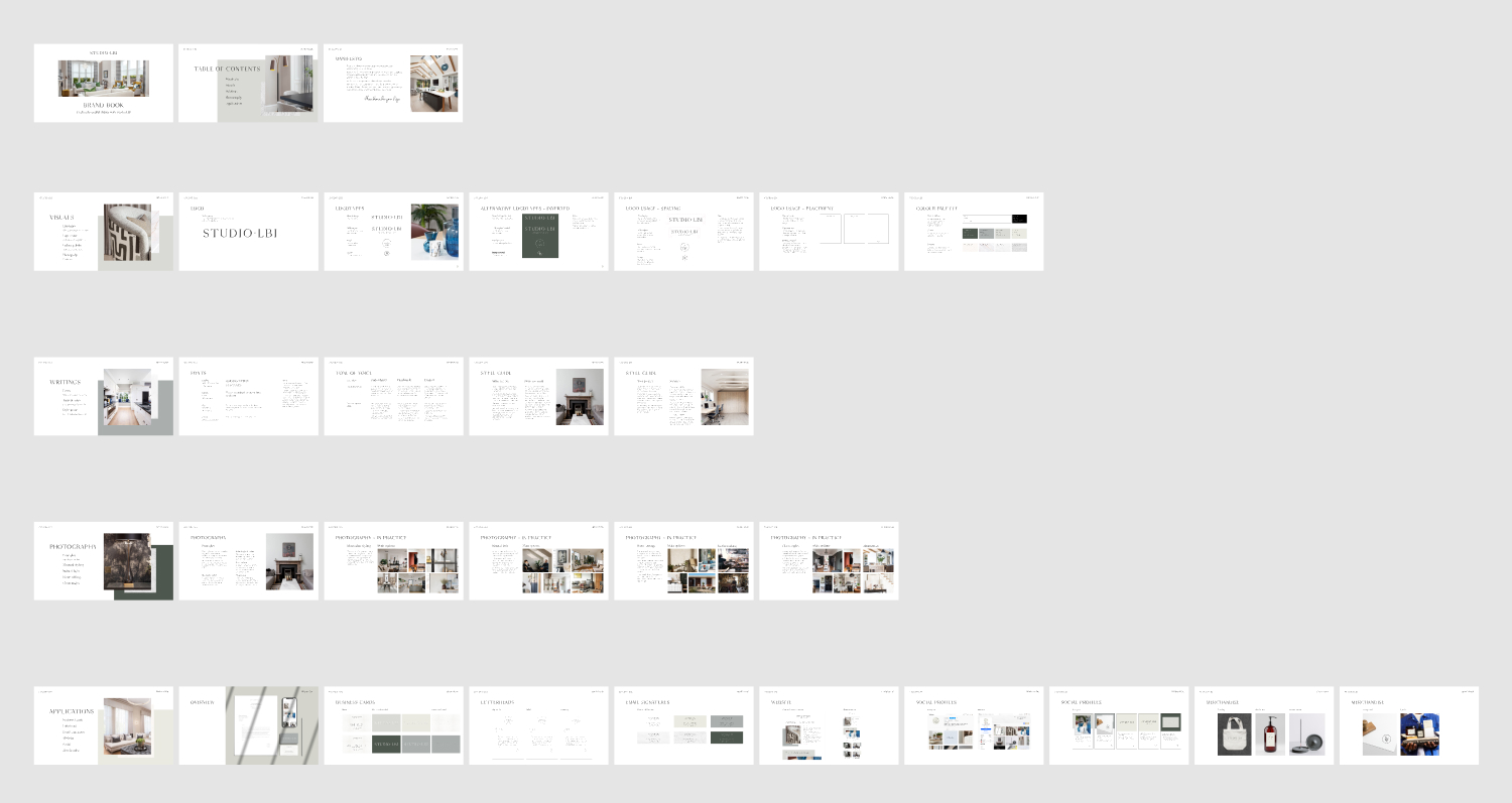
Developing the brand into a full identity system including messaging architecture, tone of voice, logo and visual identity usage, colour ways, photography guidelines, applications and templates.
Applications
From stationary, letterhead and business cards all the way to sceals and stamps, we wanted to provide Studio LBI with all the tools necessary to apply their brand in understated ways.
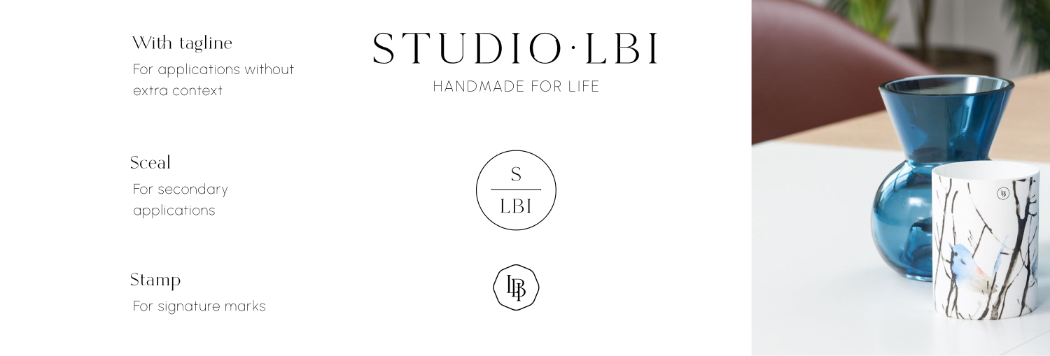
The secondary logo comes with the studio’s ambition, which is rooted in the brand strategy and research. It touches on the craft, the timelessness and the bespoke aspect of their pieces. The sceal and is designed for smaller applications, while the stamp is the studio’s mark.
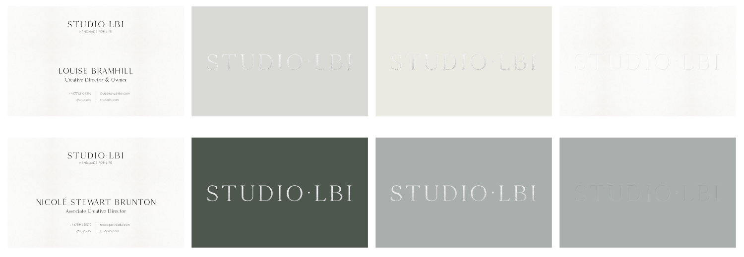
The applications of the visual identity on business cards and banners is in line with the organic feel of the system. Understated foiling and embossing add a level of sophistication through craft, rather than simply for the sake of it.
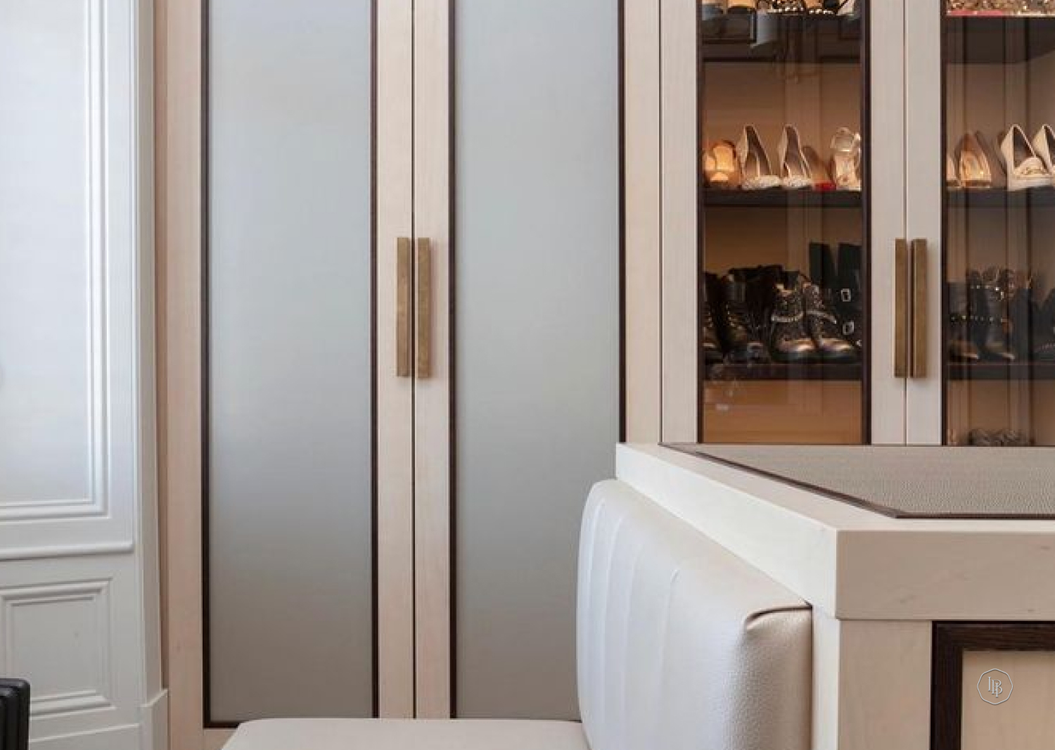
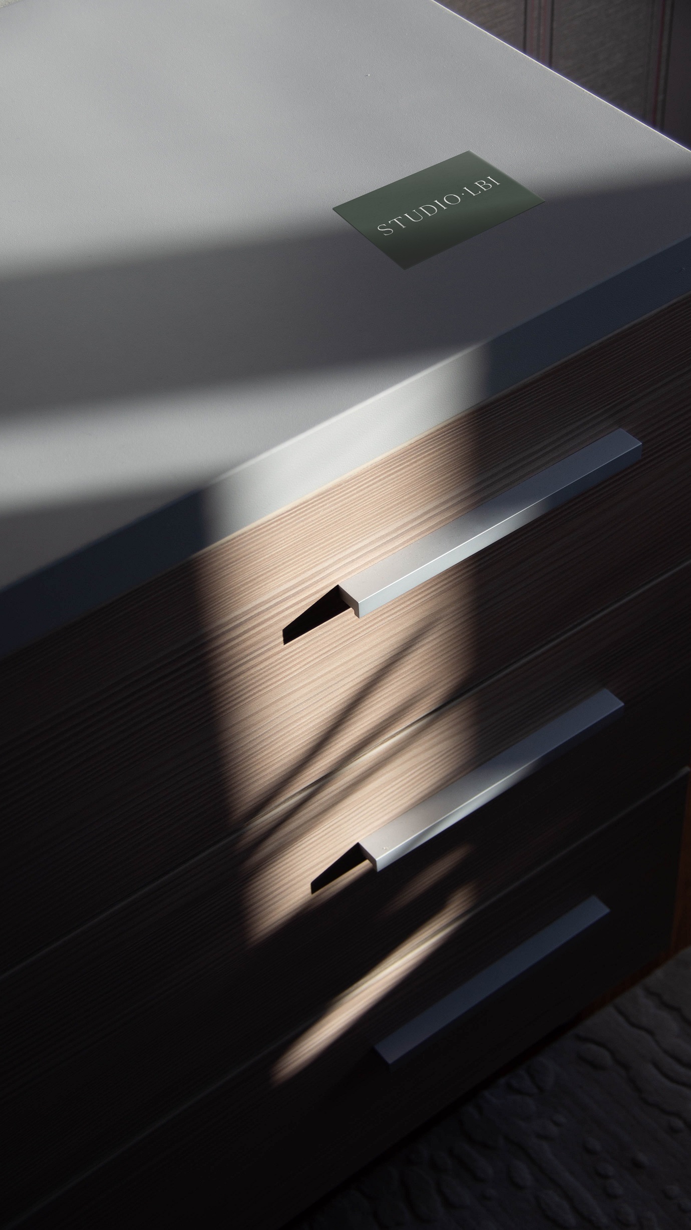
The mark would always be an understated accent, to be found in the inside of a drawer or in a less expected corner. Here it is portrayed on the outside of a furniture piece as a silver-hued ceramic sceal, showing with subtlety even in a more overt setting.
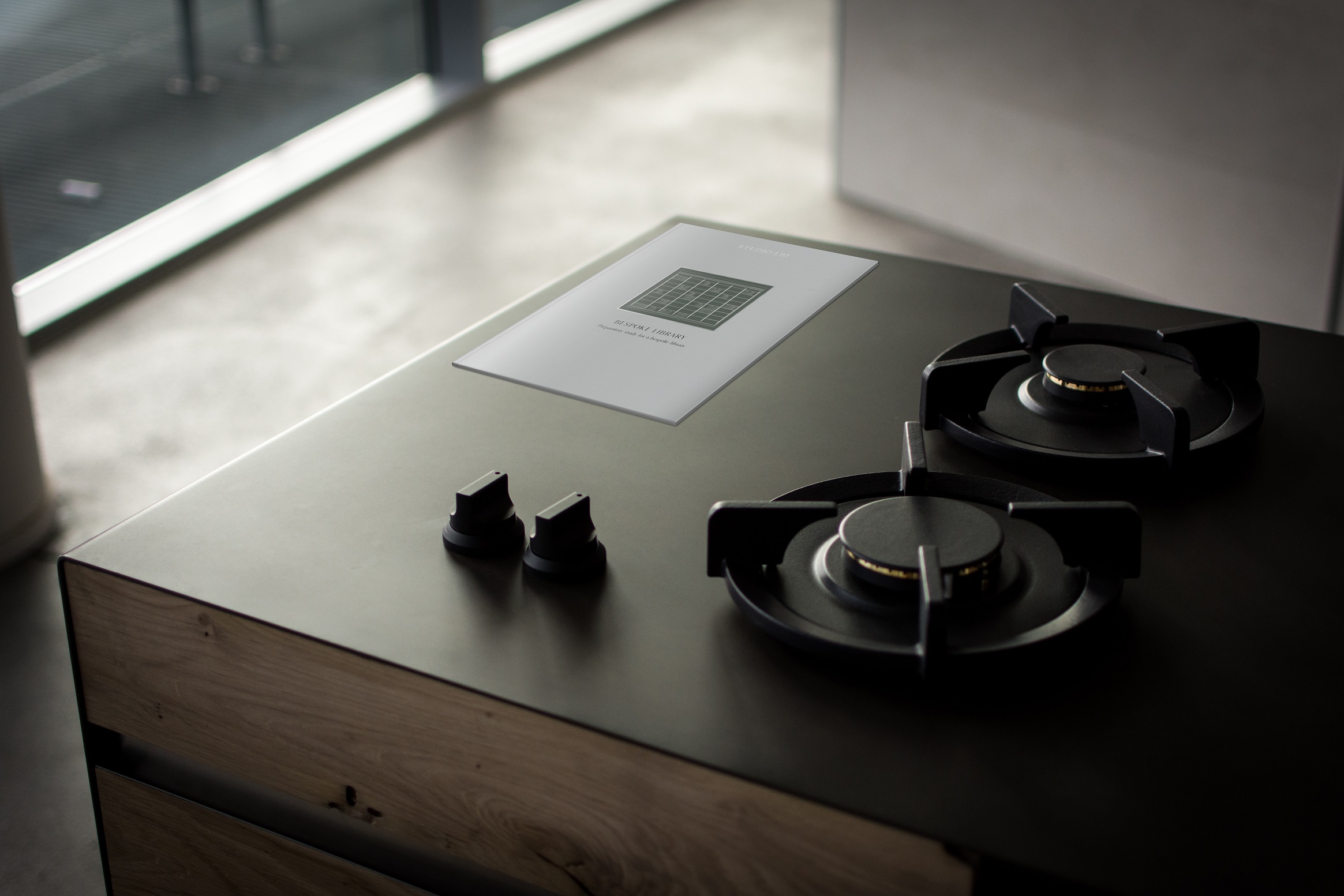
A printed proposal can go a long way to bring to life a project, especially when it comes to personal passions. Here we show how it could be done with a smart, slim proposal using a 600 gsm cover and either saddle-stitching or case binding (as pictured here).
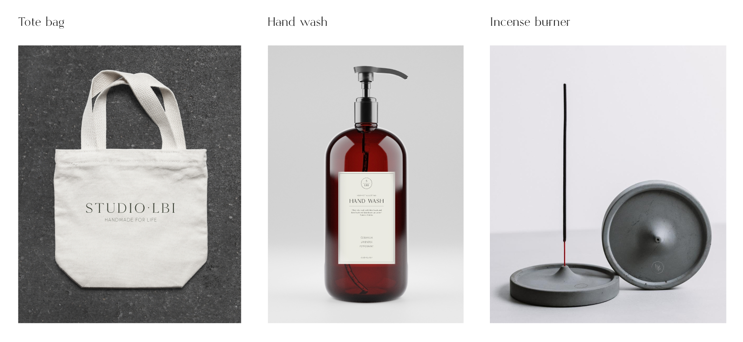
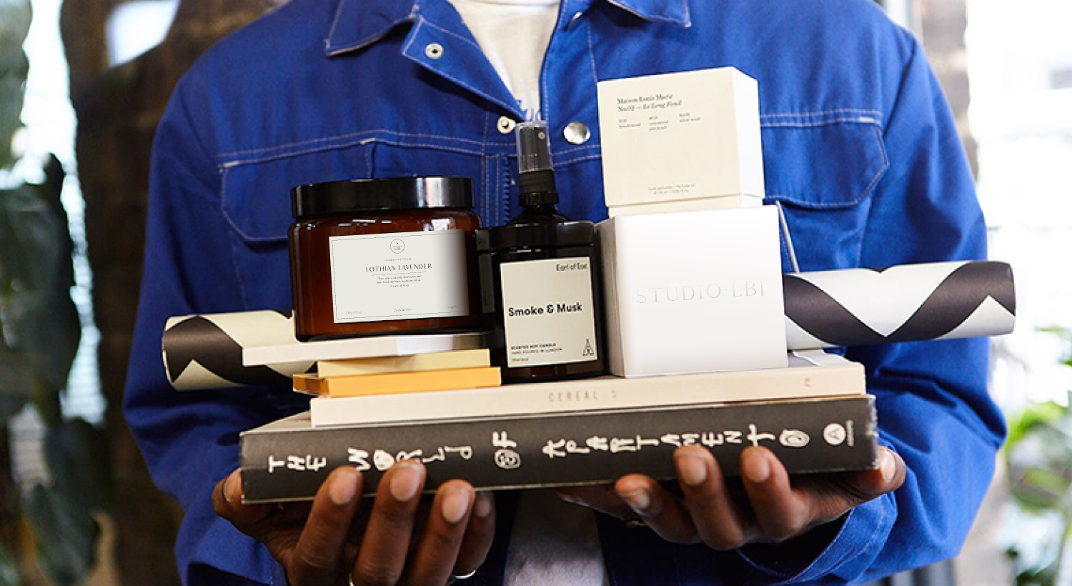
Studies of possible home amenities and design objects which could be designed to celebrate the delivery of a project.