HOSPITALITY CONSULTING / BRANDING
Resfreshing a leading consultancy: AJL Atelier
Visual identity refresh and new website and collaterals for AJL Atelier, the go-to partner for the short-term rental industry
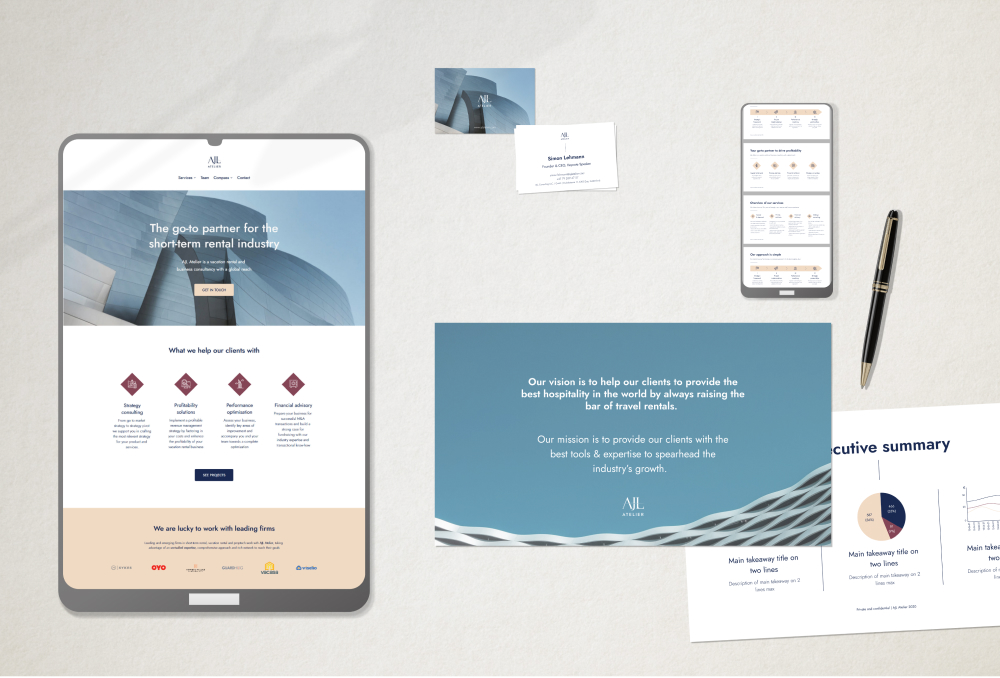
AJL Consulting has long been a trusted partner of the short-term rental industry, accompanying many of its leading and up-and-coming organisations.
Reflecting on their journey and current offerings, the team led by Simon Lehmann realised the need to refresh their brand, visual identity and website, to better represent their value proposition to the industry.
From AJL Consulting to AJL Atelier: a refreshed identity
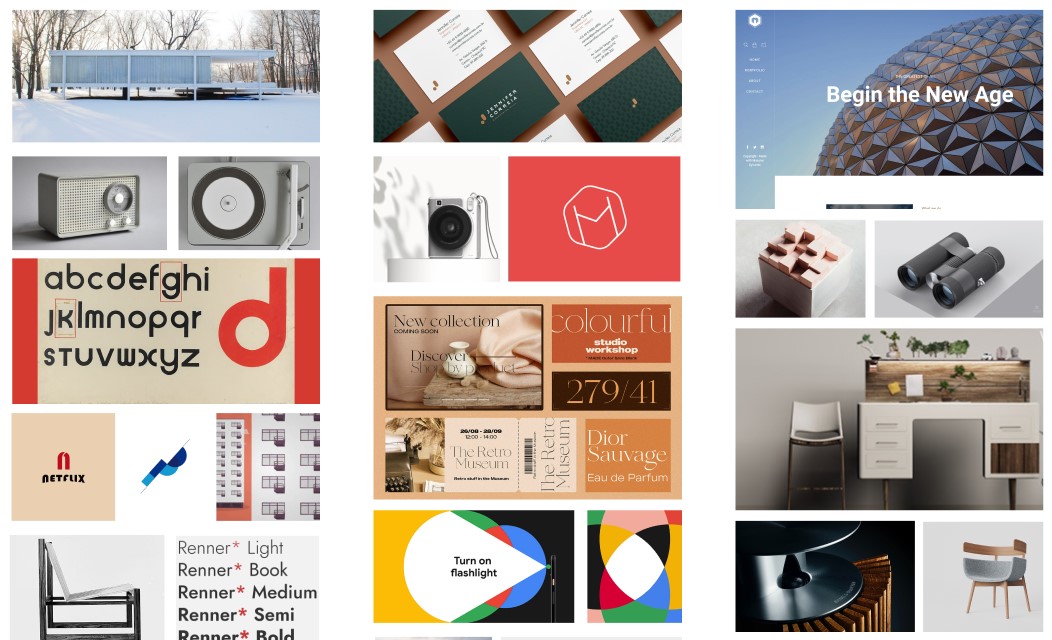
Moodboards helped to refine what felt right for the team and the brand, in a very visual way.
Brand strategy & creative route
The early stage of the work was based on many a conversation with the founders, Simon Lehmann and Cristina Lehmann, as well as the team.
Having worked with them for some time, I knew how far-reaching their expertise is in the short-term rental industry. Their stellar client and partner list speaks for itself. It’s a small practice that feels much bigger, and had built an enviable reputation over years of proven track record and high-quality work.
Their approach is not unlike that of high-end watchmakers: precise, yet bespoke.
Another intriguing characteristic was their offices in Switzerland and Barcelona, serving clients all over the world from the U.S. to Australia.
The creative direction which started to emerge was that of contemporary artisans. Their approach was not unlike that of high-end watchmakers: precise, yet bespoke; cutting-edge, when it adds value; science, with a touch of art.
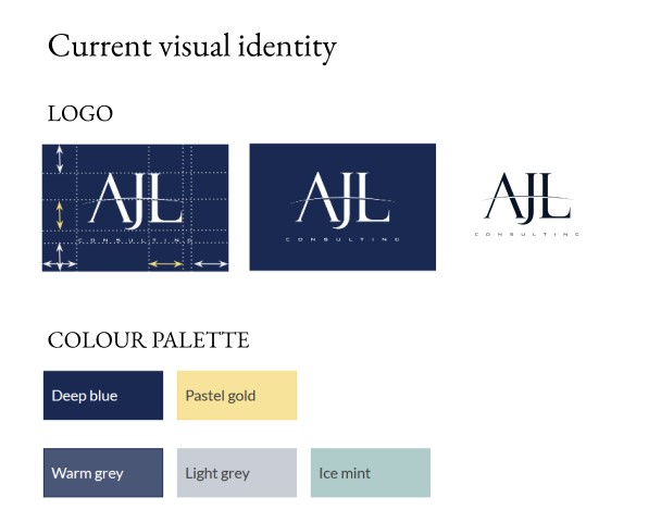
AJL Consulting – logo and visual identity prior to the refresh
Name and visual identity
We looked at various options to convey the scale, reach and expertise of the practice, inspired by the principles of contemporary artisans. We also wanted to keep part of the existing logotype.
For the name, AJL Atelier was the perfect combination, suggesting the smaller scale, premium output, a passion for every project and a touch of European origin. Plus, Atelier encompassed much better the multiple ways the team had been helping their clients.
Visually, we looked to echo master craftsmen across architecture, engineering and design, taking cues from the timeless lines of a Mies van der Rohe home, a Dieter Rams music player or the first cuts of Helvetica.
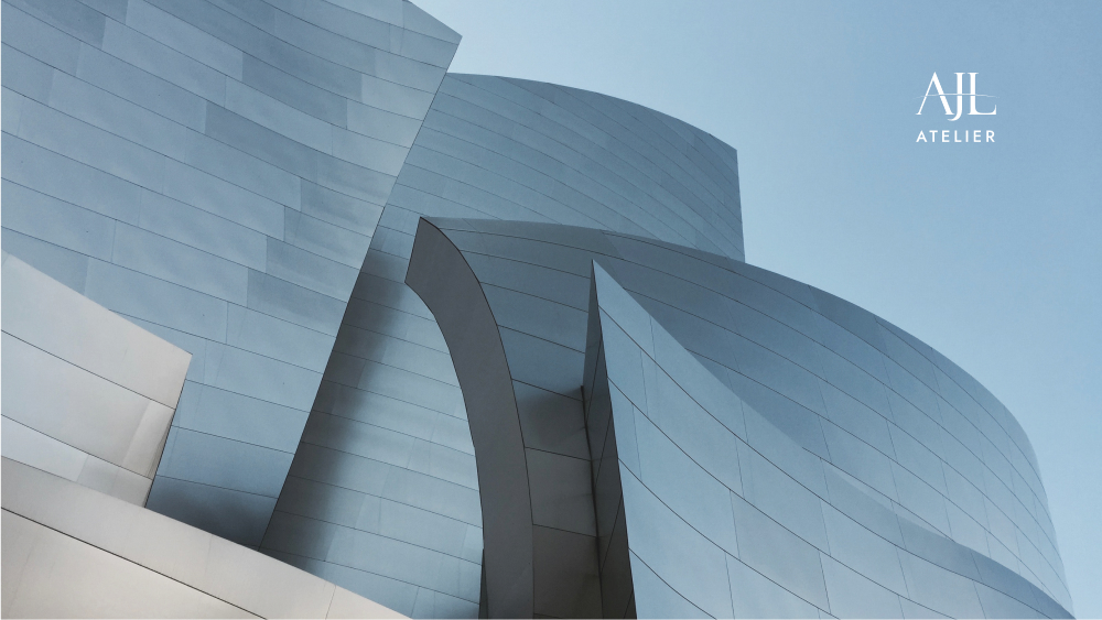


The overall feel is pared down and sophisticated, applying its geometry and centred approach to a whole suite of collaterals
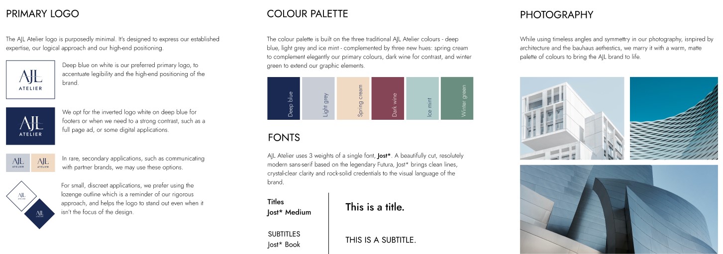
As with the logo, the palette builds on existing shades to preserve the brand equity and maximise recognition. The logo itself is declined for a variety of digital and physical uses, as well as along the practice’s offerings.

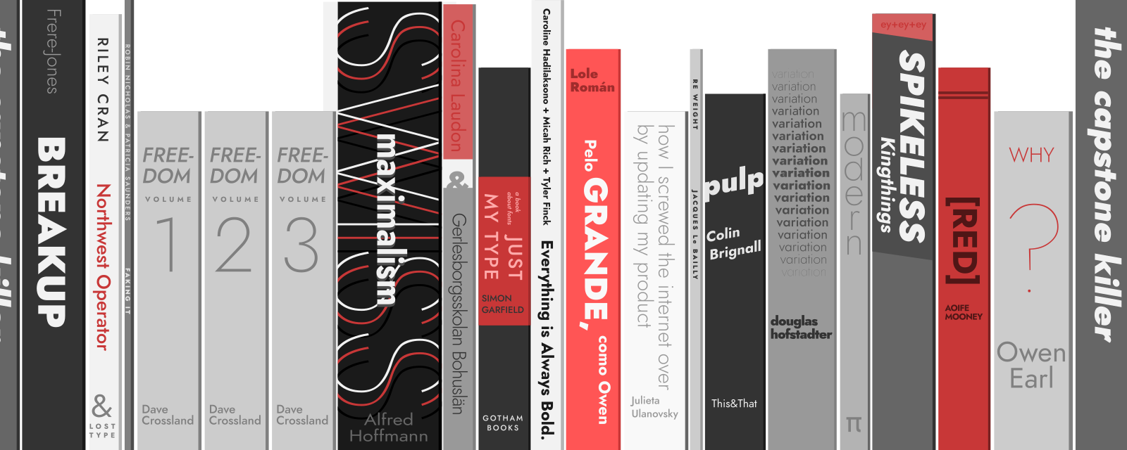
Indestructible Type’s Futura-inspired Jost* is used for a clean, modern yet timeless feel. Its versatility and large extended character set means it covers words in most of our clients’ languages
Applications
We looked at the existing client relationships and what were the most important inflexion points, to determine where to focus.
Classic pieces such as the website, proposal template and presentation were easy answers, along with less expected ones like an animated podcast / videocast introduction and events communications templates.
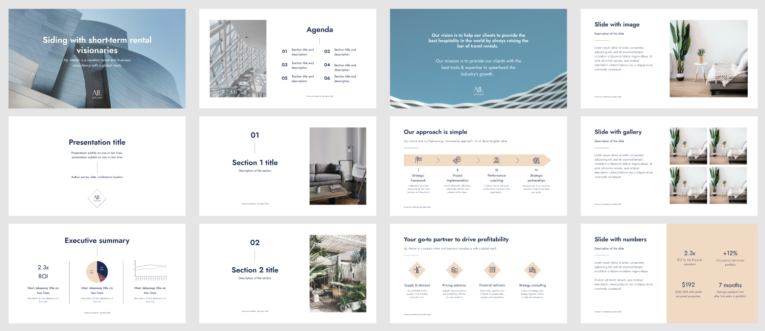
Proposals and portfolios are key pieces of communications, which were refreshed as well to maximise the impact of the new brand
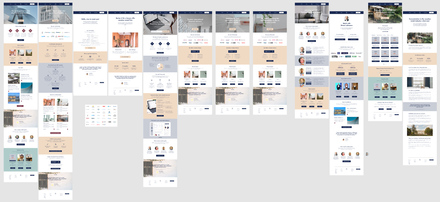
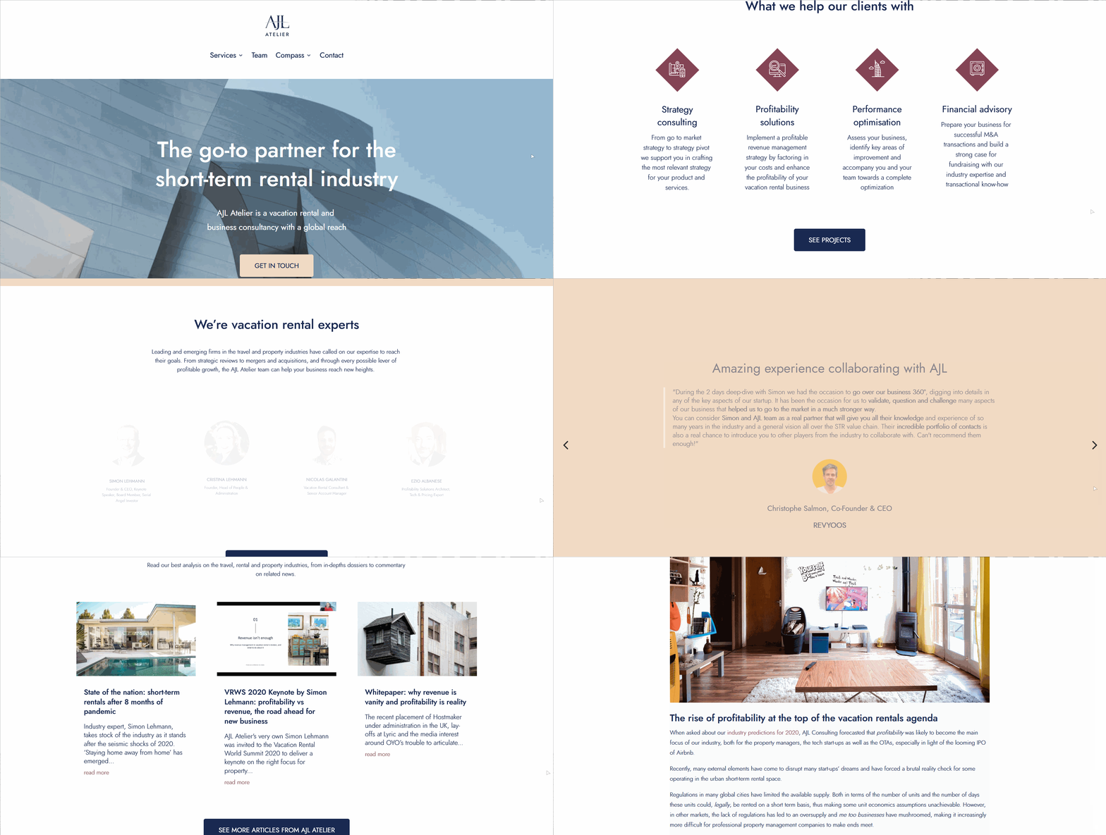
The website at ajlatelier.com was wireframed, mocked up and rebuilt from scratch on a new server and with a new tech stack, following a detailed brief created collaboratively with the team at AJL and integrating their newest offerings (Talent, Education, Profitability Solutions)

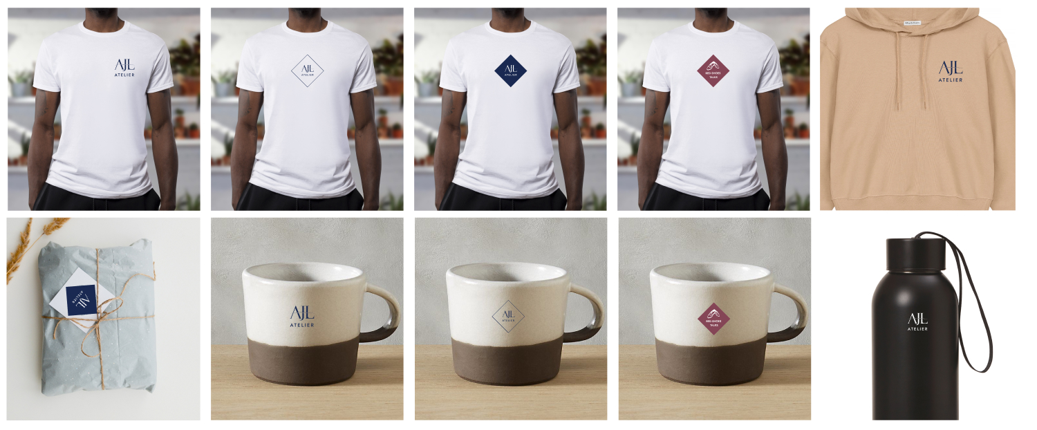
Other applications included email signatures, social media banners as well as selected merchandise.