by rmlfvr | May 16, 2021 | Branding, Communications
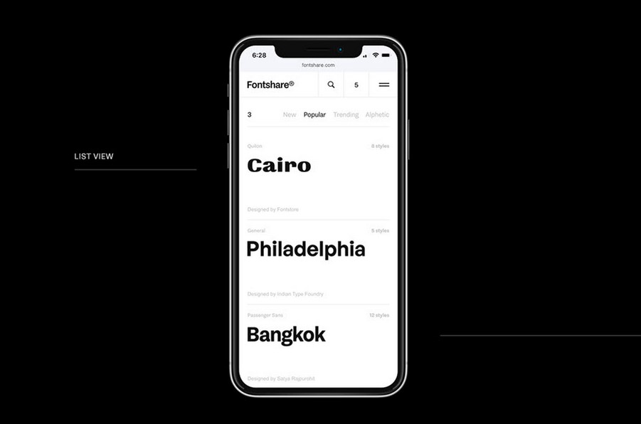
The Indian Type Foundry, one of the most prolific professional type creators of recent years, has release a new site called Fontshare. It features 52 unique fonts, ranging from workhorse geometric, like Satoshi, to weighty grotesque, like Clash Grotesk. The collection...
by rmlfvr | May 2, 2021 | Communications
You may have heard already: Microsoft is retiring its default Office font, Calibri, and introducing 5 potential successors. FastCompany covers what made Calibri such a clever project, and why it’s high-time to retire it. In a nutshell: it was a bespoke design...
by rmlfvr | Apr 7, 2018 | Uncategorised
Braille Neue is a typeface plugging the gap between visible characters and the Braille alphabet. This brilliant initiative, in the vein of other inclusive design examples, shows how small changes can help to help us all live together.