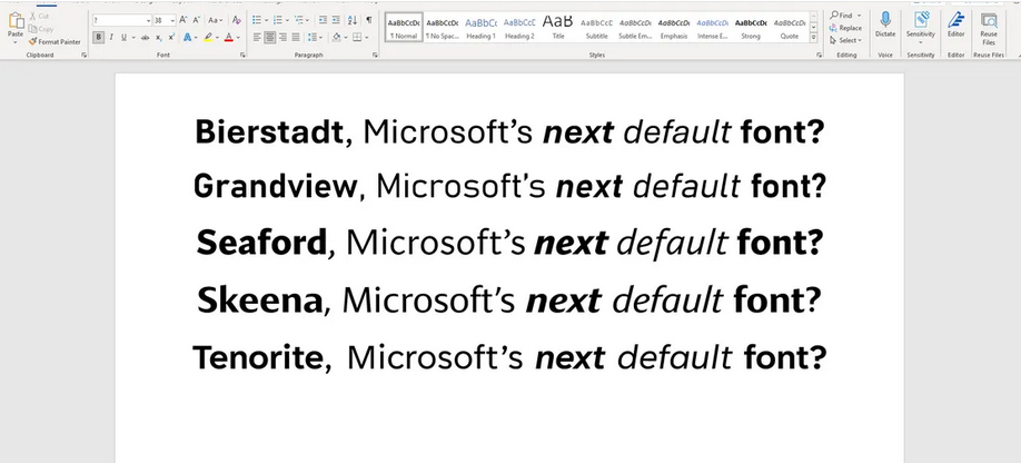
You may have heard already: Microsoft is retiring its default Office font, Calibri, and introducing 5 potential successors. FastCompany covers what made Calibri such a clever project, and why it’s high-time to retire it.
In a nutshell: it was a bespoke design for ClearType technology and lower resolution screens, both of which are now firmly things of the past. Now, instead of simply going for one new default font for its Office apps, Microsoft has opened up the field and introduced no less than 5 new workhorse fonts to take the mantle.
They’re called Bierstadt, Grandview, Seaford, Skeena and Tenorite.
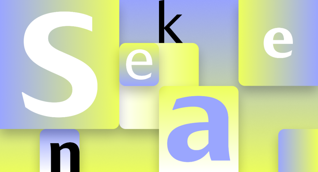
All have their merits, but here I argue why Skeena, designed by John Hudson and Paul Hanslow, will be my top choice.

It’s bold
First off, Skeena is quite a departure from existing default sans serif, from Arial to Helvetica. While in keeping with the codes of a classic sans-serif – legibility, consistency in weight & limited contrast, scalability notably – it is the boldest of the set. You can tell the designers started with the display font in mind, bringing more of that distinctiveness forward.
In the words of John Hudson: “Microsoft wanted us to design for both text and display fonts, I decided we should use the latter to push the stroke contrast further.”
Its thins and thicks are beautifully contrasted, with sensual curves and elegant lines. Its glyphs spacing balances legibility with a remarkably condensed setting.
It’s humanist
I – rather obviously if you’re reading this on my website – love grotesque and neo-grotesques fonts, and there’s a little more of that pedigree in Skeena.
As opposed to more immediately geometric options in the set, like the robust Tenorite, Skeena feels intentional and is full of character. The details make the human hand behind it more obvious, and that brings a lot of warmth and personality to the final design.
It feels premium
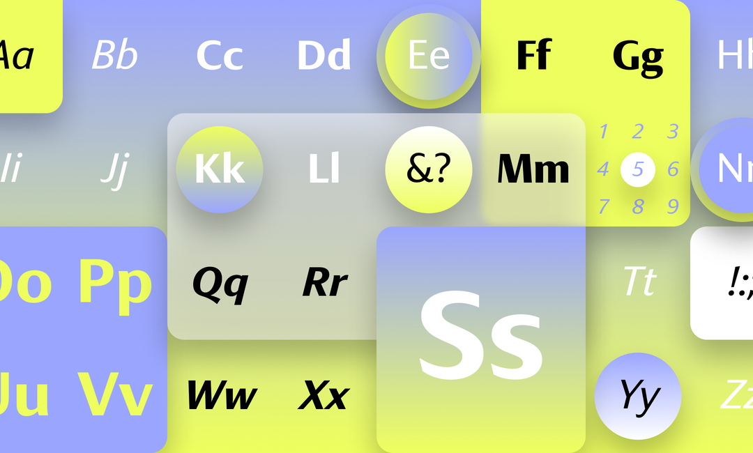
It could be the sheared diagonal terminates or the exaggerated proportions of the S, Q and O, or perhaps the elegance of the minuscule bold e. The smallets details have been looked into and harck back to a number of different type eras and families, yet somehow work well together.
That’s tricky to do, and reminds me of fashion houses going through their archives to bring seemingly disparate influences to bear in a completely new design. More than crafted, it feels sculpted.

The team at The Verge has been testing the various fonts in different Office programmes and has shared their thoughts. Again, they all are beautifully designed, but if I’d have to choose one, I’d go with Skeena.
