ART & DESIGN STUDIO / BRANDING
Creating a brand for a new art studio: Past & Found Studio
Creation of a new brand and visual identity for a London-based art and design studio creating unique pieces based on found photography
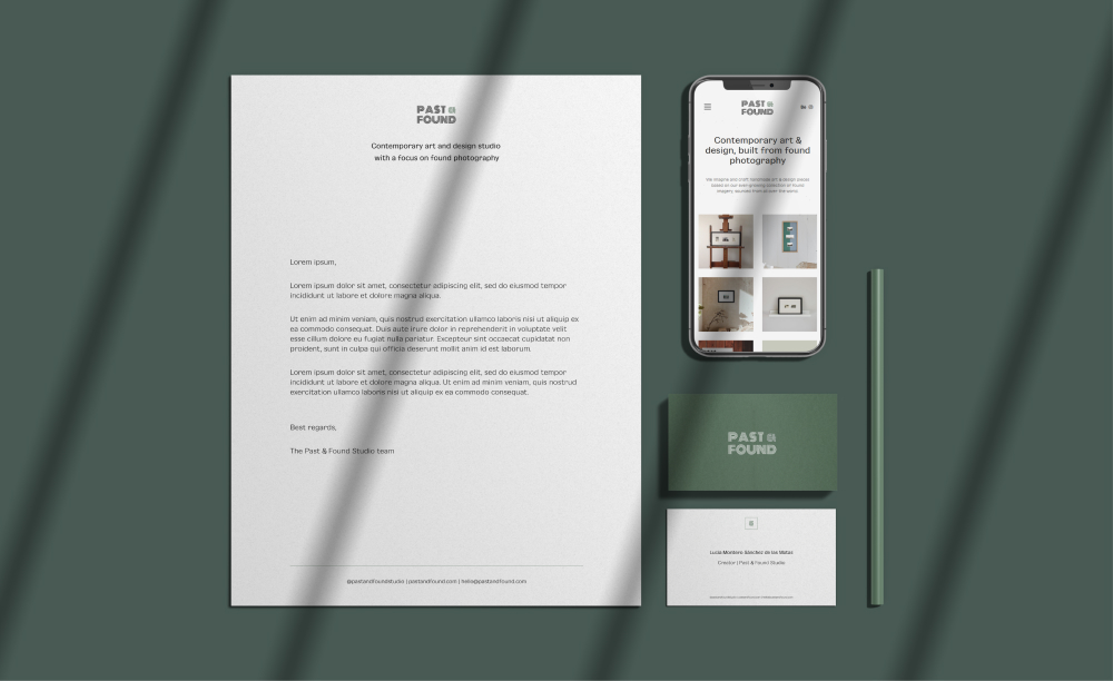
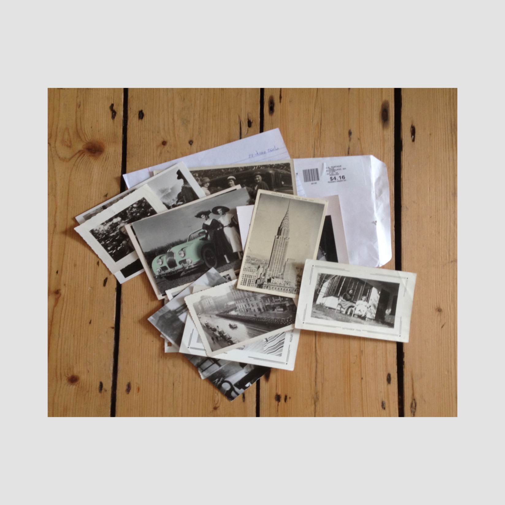
Founded by a London-based collective of artists and designers, Past & Found Studio creates unique art pieces from an archive of found photographs.
We worked together to name and brand the new studio, channeling its ethos of celebrating remnants of memories often discarded or forgotten.
A full visual identity with a heart for the art & design studio
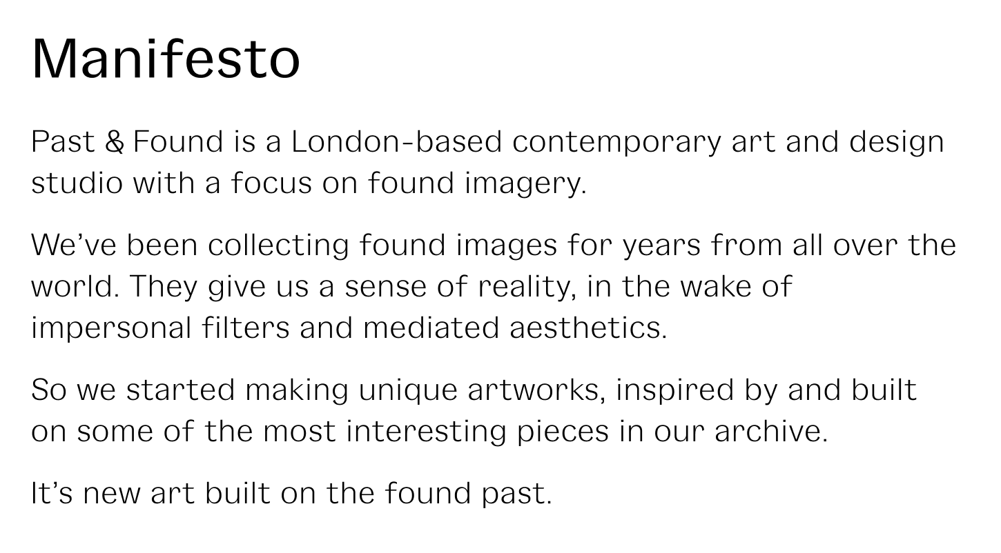
Perhaps unusually for a group of visual artists and designers, we started with a written manifesto to set our common creative direction.
Brand strategy & creative route
The core idea behind the collaboration is that of celebrating found material – notablly photos – by making them into unique art pieces.
There are elements of interrogating why we are driven towards some found photos and not others, as well as how to best arrange the archive into pieces, avoiding convoluted treatments.
We want to imagine pieces that transport viewers into spaces of their choice – moments in time, places they have visited – with powerfully simple arrangements
The creative direction we arrived at was simple, and the moodboarding minimal: it was all about letting the pieces speak for themselves, rather than getting in the way.
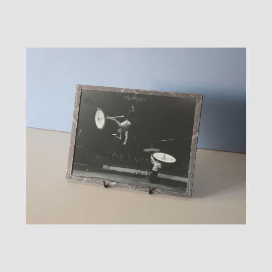
The aesthetics were born from some of the early pieces created by the collective
Name and visual identity
Past & Found Studio appealed to all of us, for its simplicity and obvious nod to our approach.
Out of the original shortlist of 20+ names, it presented the advantage of being agnostic of any medium, leaving us the opportunity to create pieces beyond photography and collages.
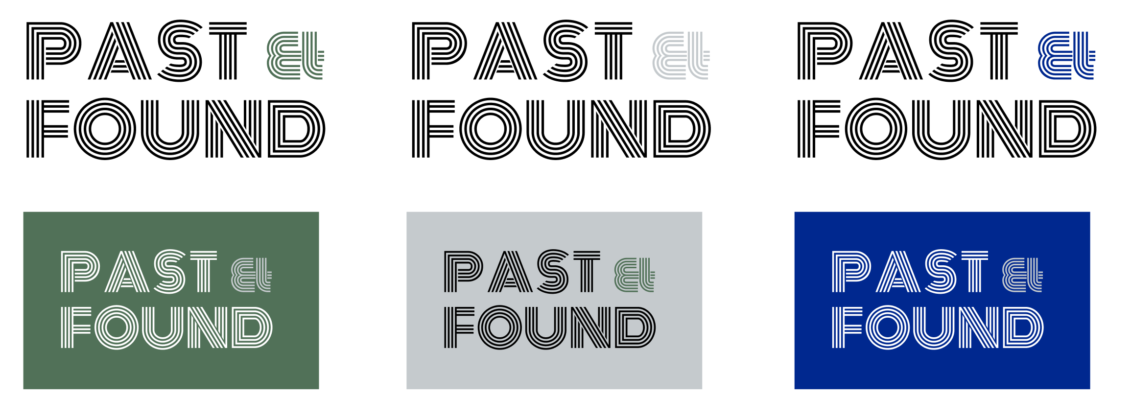
The logotype draws inspiration from a number of sources, including Japanese hot-stamping methods, tunr-of-the-century Central European hand-pressed printing and more contemporary neon signage.

The overall identity feels a little more muted, leaving a lot of space for the artworks to breathe and take centre-stage. It is designed to feel elegant but not daunting or overly luxurious: we purposedly made it more inclusive.
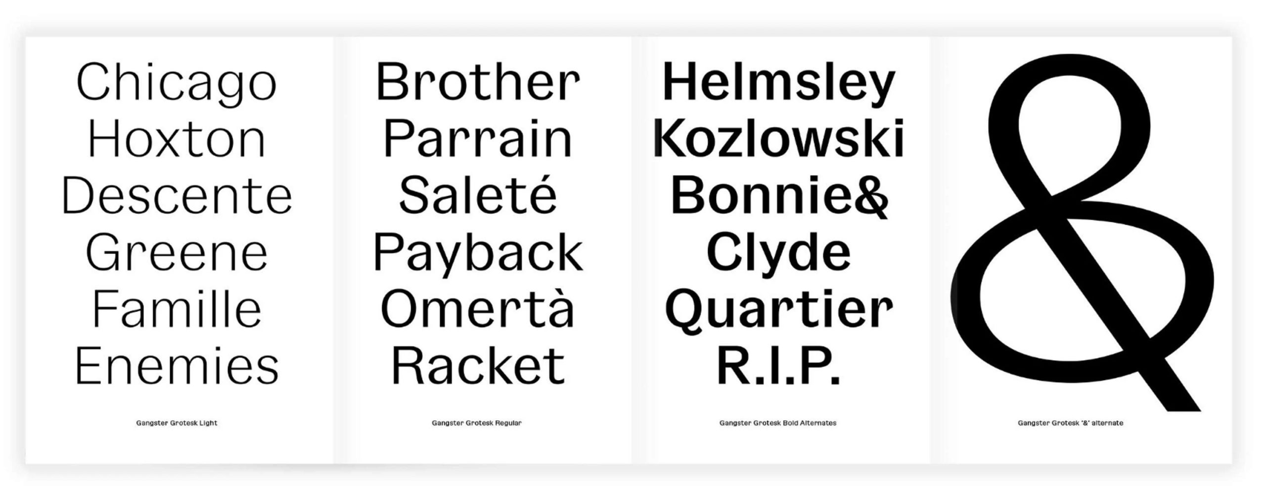
We opted for the beautifully designed Gangster Grotesk from Pizza Typefaces to induce playfulness and personality into the overall branding.
Applications
On top of the usual pieces of visual identity such as the business cards and note cards, we also set out to think through the online retail part from the website and e-shop all the way to packaging and shipping.
This implied consistent photography and mock-up guidelines and creation, as well some adjustments as the first sales got going.
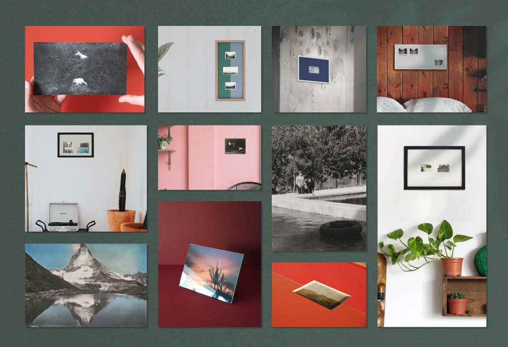
Making the pieces more approchable by creating realistic mock-ups helped visitors to picture them in situ. We were also keen to showcase the process and the found material on which each piece is based.
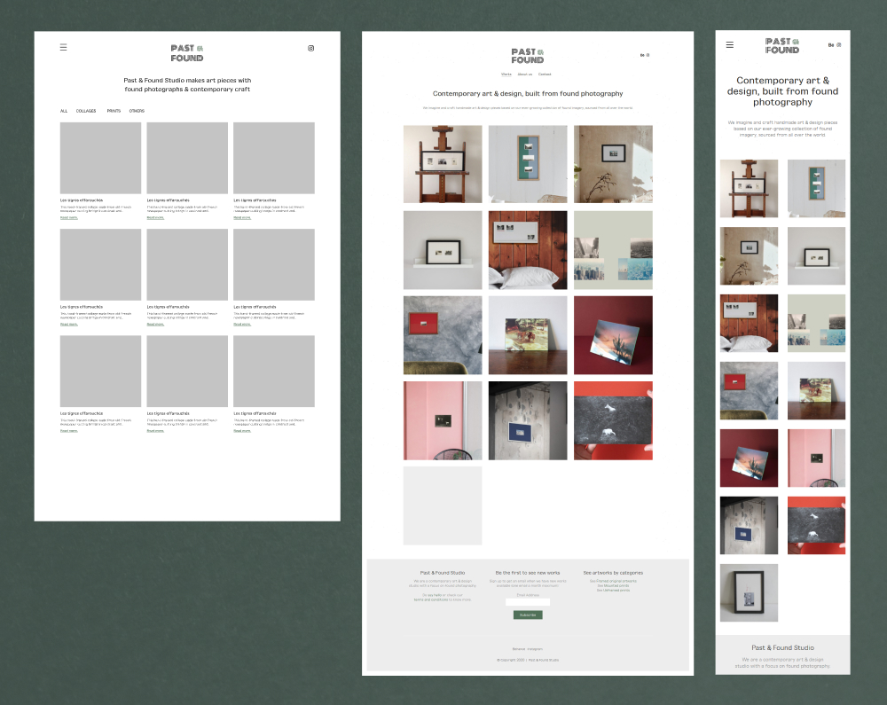
The website at pastandfound.com stayed extremely close to the original wireframes (left) when released (right).
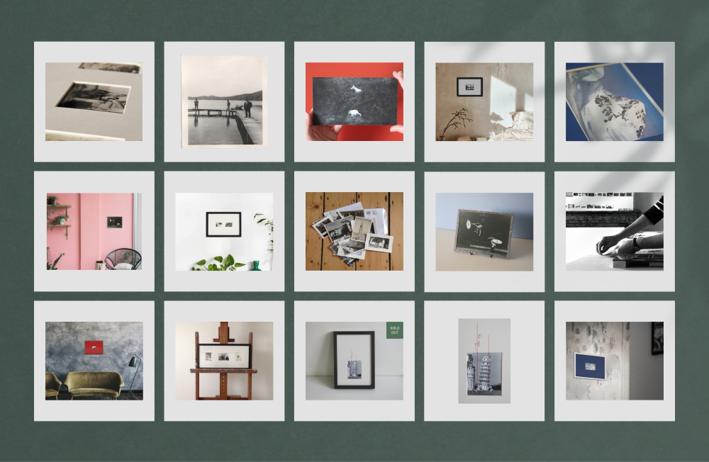
Social media posts were kept consistent to ellicit a coherent feel in one’s feed.


Personalised note cards included in every parcel allow us to share our thoughts on the piece further with the client who chose to purchase it. Email signatures keep with the muted approach.